
What Six Months of Meeting Data Reveals About Your Team
I once lined up half a year of one recurring meeting and looked at it as a single sequence instead of a stack of separate sessions. I had been in almost every one of them. I had only ever experienced them the way everyone does, one at a time, judged against the one before it and forgotten by the following week.
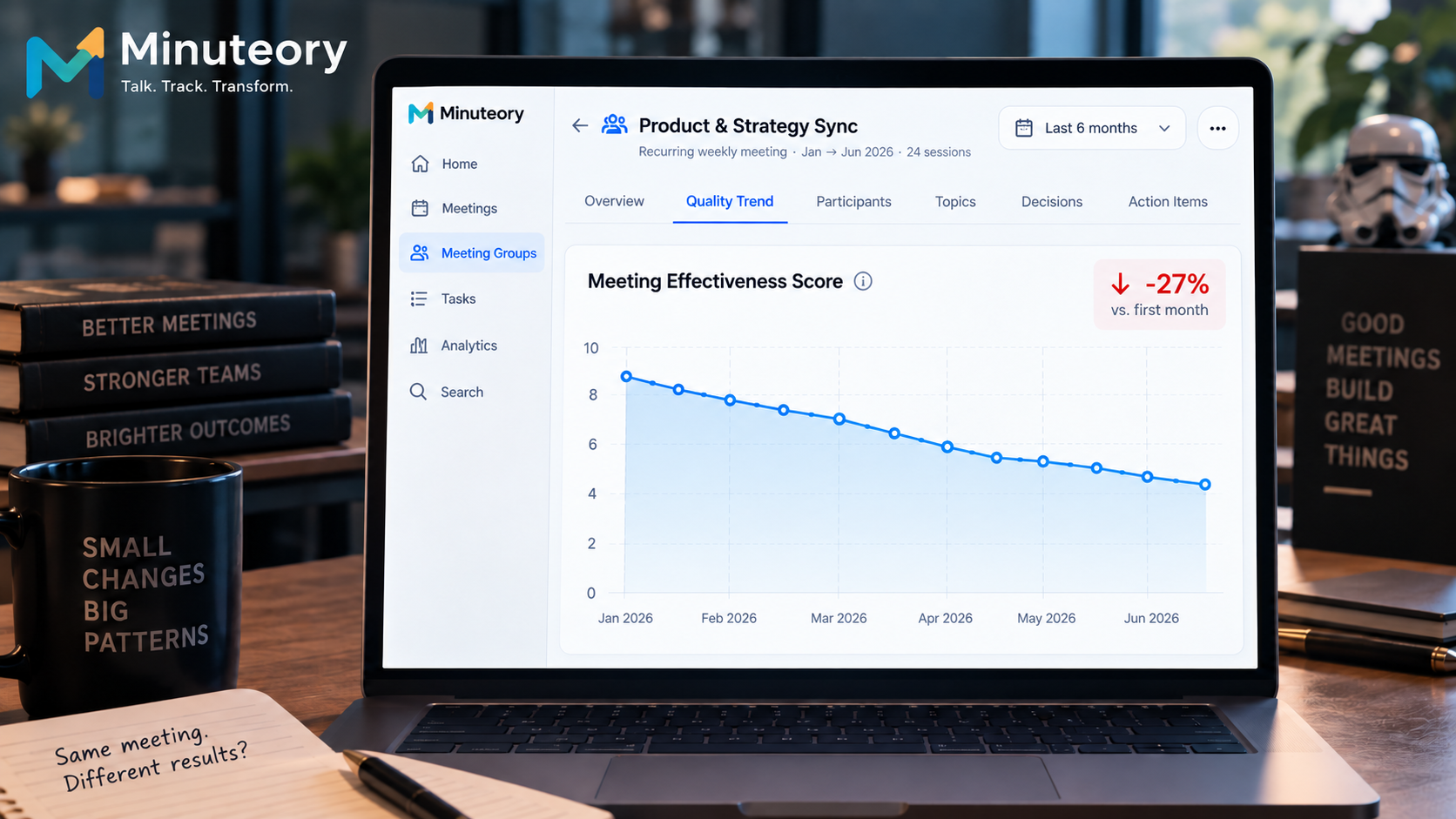
Seen in order, the meetings told a story I had lived through without noticing. Early on they were sharp. Decisions landed, the right people drove them, and each session clearly moved something. Somewhere around the middle the same meeting, with the same people and the same agenda, had gone soft. The decisions came slower and mattered less. Attendance was unchanged, the calendar invite was unchanged, and on any given week it still looked fine. Only across months could you see that the meeting had been quietly losing its edge the whole time.
That is the thing about meeting quality. It does not fall off a cliff on a Tuesday. It erodes, and erosion is invisible to anyone who only ever looks at the most recent session. This post is about what becomes visible when you stop looking at one meeting at a time and start looking at the trend.
Why meeting quality trends stay invisible week to week
Every recurring meeting is judged against a very short memory. You compare this week to last week, notice nothing dramatic, and move on. A five percent drop in how much a session actually accomplishes does not register against that baseline, because the baseline is itself drifting down at roughly the same rate. Each week feels normal because each week is only slightly worse than the one you have already accepted.
There is also no natural artifact that holds the pattern. Notes from a single meeting describe that meeting. The moment the next one happens, the previous notes are filed away and effectively gone. Nobody sits down to read six months of a meeting in a row, because doing it by hand would take most of a day and there is never a day. So the long slow shape of a meeting getting worse never assembles into something a person can see, which means it never gets fixed. It just continues. Microsoft's 2025 Work Trend Index, drawing on data from 31,000 workers across 31 countries, found that inefficient meetings are the number one barrier to productivity — and the recurring meetings where quality has quietly eroded are the hardest ones to catch, because everyone only ever compares this week to last. The same blind spot appears in the meeting metric most leaders never track.
How meeting quality trends become visible with the right data
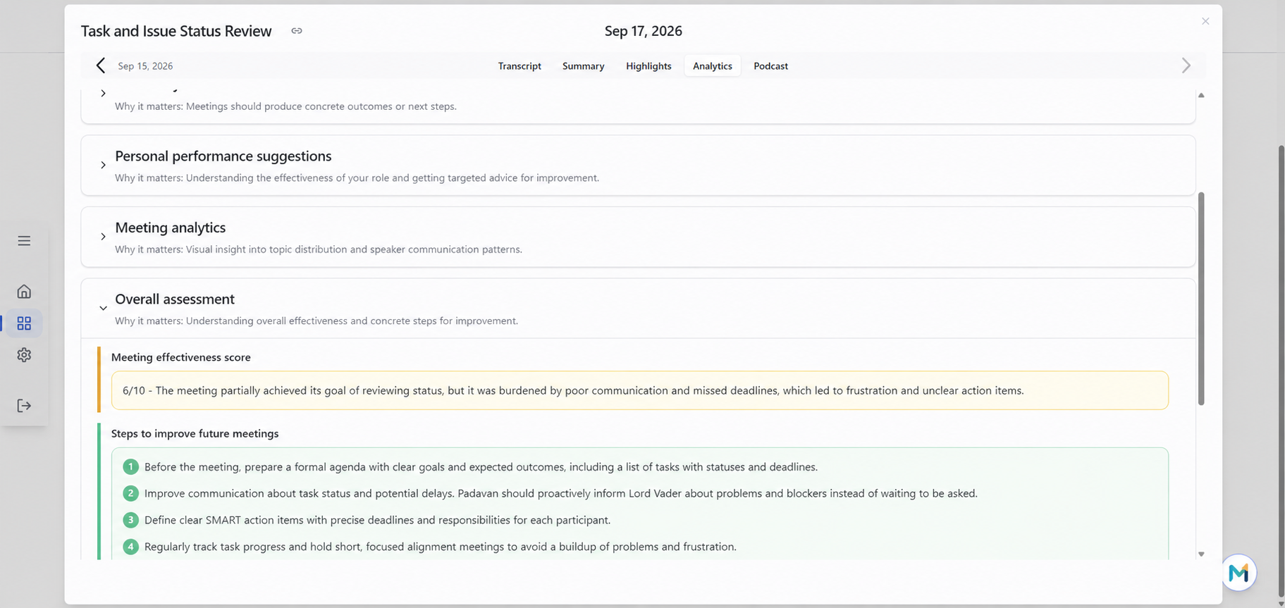
Minuteory scores each meeting across the same six dimensions every time, which is what makes a trend possible in the first place. When the measure is consistent, the movement means something. A meeting that scored well on outcomes in March and mediocre in June has not changed its format, it has changed its results, and the score records that even when no one in the room felt it happen. For the single-session view, see how to measure whether a single meeting worked.
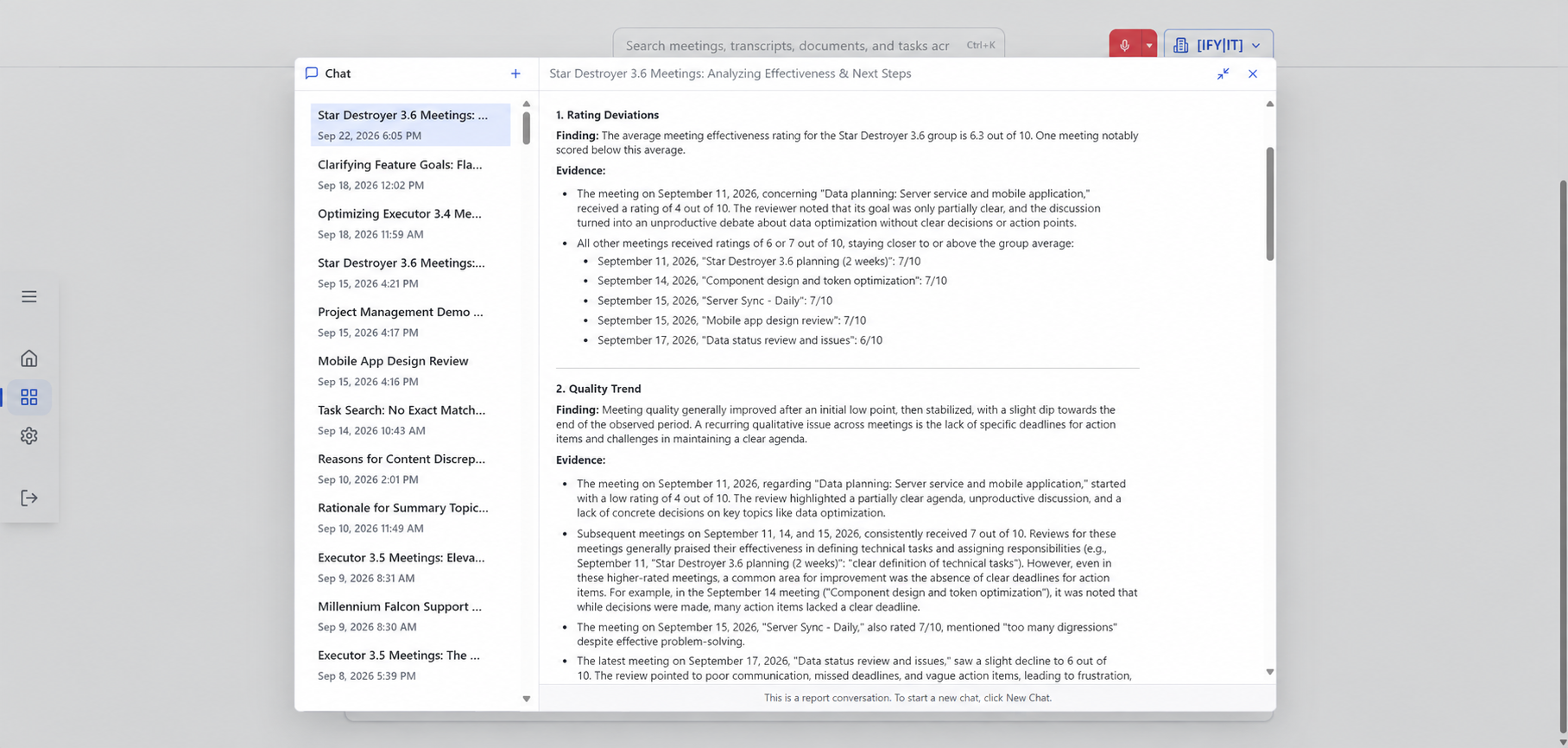
The piece that turns individual scores into a trend is meeting groups. When you connect a recurring or related series of meetings into a single thread, the sessions stop being isolated and become a narrative over time. You can then read the series as a sequence rather than a pile, and you can ask the assistant to generate an analytical report across that whole meeting group instead of one session. The half day of manual reading that nobody ever does becomes something the system does across the connected thread.
Reading a series this way changes what you notice. A single session gives you a verdict on one meeting. A connected thread gives you a direction, and direction is what you actually make decisions from. You stop asking whether last Tuesday's meeting was any good and start asking whether this meeting has been getting better or worse since the spring. That second question is the one worth answering, because it points at a trend with a cause, an agenda that drifted or a decision that migrated to a smaller group, rather than a single session that can always be explained away as an off day.
Because the scoring is organized by meeting type, the trend also tells you where to look. A weekly operations meeting and a monthly review are held to the criteria that fit each, so you can see that one meeting type is holding steady while another is sliding. That is a far more useful signal than a single company wide sense that meetings feel worse lately. It points at the specific recurring meeting that is drifting, while the others are fine.
What the trend tells you that a single meeting cannot
A single meeting score answers whether that meeting worked. A trend answers a different and more important question: which of your recurring meetings is getting better, which is getting worse, and how fast. That is the difference between a snapshot and a diagnosis. A snapshot can be explained away as an off day. A downward trend across two months cannot, and it usually has a specific cause: an agenda that outlived its purpose, a participant list that was never updated, a decision that quietly moved to a smaller group and hollowed out the larger meeting.
The trend also protects you from the opposite error, cutting a meeting that is actually improving because it had one bad session. Over time the data separates a real decline from noise, so the decisions you make about which meetings to keep, reshape, or end are based on the pattern rather than the last thing that happened.
None of this asks you to become an analyst. The scoring already happens on every meeting, and connecting a recurring series into a thread is a one time setup. After that the trend assembles itself, meeting by meeting, until the shape that used to take half a day of reading to see is simply there when you open the group. The very thing that made the erosion invisible, the fact that nobody ever reads six months of a meeting in a row, is the work the system quietly takes off your hands.
A test you can run on one recurring meeting
Pick a meeting you have held at least six times. Instead of judging the most recent session, put the last six in order and compare the first two against the last two on one question: did the meeting produce clear decisions with owners, or did it mostly produce discussion. Be honest about the direction. Most people find the meeting has moved one way or the other and that they had not noticed, because they were always comparing each session only to the one before it.
That direction, up or down, is the single most useful thing you can know about a recurring meeting, and it is exactly the thing no individual session will ever tell you. Once you can see the trend, the fix is usually obvious. The hard part was never the fix. It was seeing the slope at all, because a slope only exists across time, and time is the one thing a single meeting can never show you.
Where the pattern becomes a decision
Any one meeting can hide its decline. A series cannot. If you want to see what your recurring meetings actually look like across months instead of one session at a time, you can connect them and read the trend at app.minuteory.com.